
Angular Line Picture BooksA Line Allowed to Be Unsure
Twelve of the seventy-eight style briefs here ask for a confident line. An angular line picture book is built from the only one that asks for the opposite — a broken, searching contour that leaves the hand’s near-misses visible on the page.
- A broken contour — short strokes, visible gaps, faint near-miss lines beside them
- Tall, long-limbed figures caught mid-feeling, never standing still
- Bruised violet, pale ochre and ink black on mostly bare paper
- Free credits by request — no card
50,000+
Stories Created
10,000+
Active Creators
50+
Art Styles
4.9/5
User Rating
What Makes the Angular Line Style Different From Simply Sketchy
Several styles here are drawn with a pen and nothing else. This is the only one whose brief wants the hand to look like it was still deciding.
Twelve of the seventy-eight briefs ask for a confident line. This is the only one that asks for the opposite
Every style in C2Story is driven by a short written brief, and if you read all seventy-eight of them looking only at what they say about the mark, one word keeps coming back. Confident appears in twelve of them, and in ten of those it is attached directly to the line: clean confident outlines, crisp confident even lines, a confident tapering ink line, clean uniform confident lines, a clean confident single-weight line. It is the most repeated instruction in the library. This brief asks for the reverse. Its strokes are recorded as nervous searching ink strokes, its contour as broken sensitive contour lines, and its instrument — the field that tells you what the drawing is made with — reads fractured sensitive lines. It is the one style here whose line is allowed to be unsure.
Five words appear in exactly one brief in the whole library, and all five are in this one
This is not a near-miss or a matter of emphasis, and it is easy to check. Searching appears in one brief of seventy-eight. So does nervous. So does sensitive. So does anxious. So does attenuated. So do taut and distorted. Seven words, each used once in the entire library, and every one of them lands in the same place. No other style here is described in that vocabulary at all, because no other style is trying to do this: let the hesitation of the hand stay visible in the finished picture instead of cleaning it away. The gaps in the outline and the faint extra strokes beside it are not a rendering error. They are the subject.
Its fourth refusal is a pose rather than a technique
Each style lists four things to avoid, and almost all of those lists are technical — photorealism, gradients, muddy colour, gloss. This one reads clean vector, cute rounded, neutral pose, polished. The third item is the unusual one, and it is the only time in seventy-eight briefs that a style refuses a character simply standing still. The brief wants distorted twisting poses instead: a shoulder lifted higher than the other, a spine curved over, a head tipped, knees pulled up. That has a direct consequence for your book, and it is worth knowing before you choose. A page where somebody calmly stands and shows the reader a thing is working against the style. A page where somebody is in the middle of a feeling is working with it.
Ten styles share its category, and all ten disagree about the line
The graphic category holds ten styles, and comparing only their recorded line weights is the fastest way to see where this one sits. One is crisp clean shape edges, one hard-edged geometric shapes, one thick continuous black lines, one crude scrawled marker lines, one elegant simplified outlines, one thick wobbly uneven lines, one shape-based minimal outlines, one light nimble delicate lines, and one — the closest thing here to an opposite — a uniform continuous single line, a whole figure described without the pen ever leaving the paper. This one is the only fractured line among them, and the only sensitive one. Same category, same ink, completely different relationship to being sure.
Why the Angular Line Breaks on Purpose
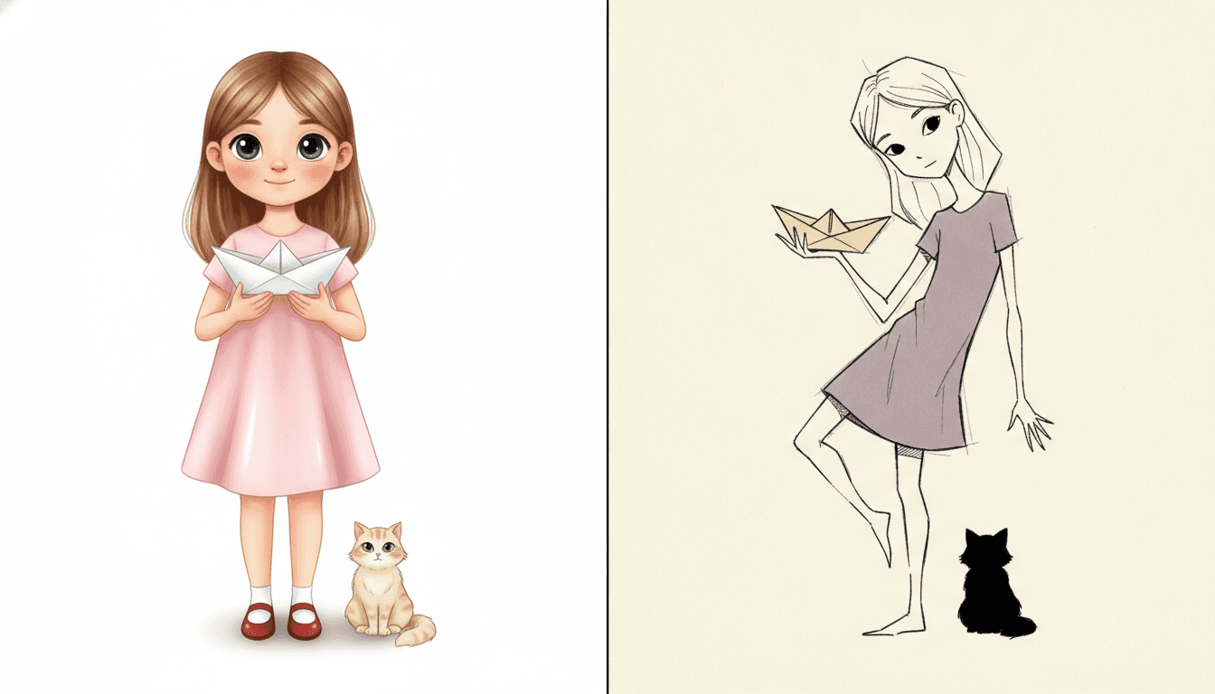
The same girl twice, with the same paper boat and the same cat. On the left she is drawn the way most illustration draws a child: one perfectly smooth unbroken outline of even weight, rounded cute proportions with her head a quarter of her height, big shiny eyes, soft gradient shading in her dress, a glossy highlight on the boat — and she is standing straight, square and still, facing the reader with her arms at her sides. Nothing is wrong with it. It is also, item for item, a list of everything this style refuses.
On the right, the same girl again. Her outline is now short separate strokes with gaps between them, and beside her shoulder and her elbow sit two or three faint lighter strokes where the pen felt for the edge and missed. She is taller and thinner, her head a seventh of her height, her hands long. Her hips face one way and her shoulders the other. The four refusals in the brief are listed in exactly that order: clean vector, cute rounded, neutral pose, polished — and the third one is the one no other style in the library uses.
So the body says it before the face does. Faces here are four or five strokes. If you want a reader to know how somebody feels, it has to be in how they are standing, kneeling or turning away.
And there is no light to help you. The lighting is recorded as stark and uneven, but nothing is modelled or shaded — so the contrast on a page comes from where you leave the paper bare.
Its four refusals, in the order the brief states them:
Write a Posture, Not an Expression
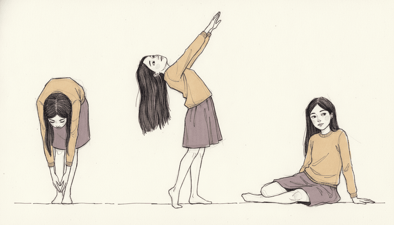
Here is a test to run on a scene before you write it. Could an actor play this page with their shoulders, from the back, with no face visible? If yes, this style will draw it well. A child folded over her own knees, a boy stretched up on his toes with his head thrown back, a girl twisted round to look behind her — those are all postures, and a posture is the one thing this brief can render better than anything else in the library. A character who is simply present in a room is not a posture, and it is the one thing the brief explicitly refuses.
So the sentences that serve it are about bodies rather than feelings or views. “He was embarrassed” gives it almost nothing to draw. “He stood with his chin pushed down into his collar and both hands jammed in his pockets” gives it a complete page. The picture here is doing exactly that: the same girl three times, folded forward, arched back, and twisted round on the floor — the same character, the same three colours, and nothing in the frame except what her body is doing.
Give your cast a build, not a hairstyle. With faces this economical, readers recognise people by height, stoop and limb length. Decide those once and everyone stays identifiable.
Leave the page mostly empty. Sparse restrained colour is in the brief. Resist filling backgrounds — a few broken lines for a wall or a tree is what this style wants behind a figure.
Worth seeing side by side before you commit: the fine-line ink style, which uses the same thin pen with a steady hand, the ligne claire style, which is the library’s purest confident line, and the crosshatch style, which spends its ink on shadow rather than on contour.
Create an Angular Line Picture Book in 3 Steps
From a one-line idea to a finished book where every page carries the same broken contour, the same three colours and the same cast, in under two minutes.
Describe the story
A sentence is enough, but put a feeling and a body in it rather than a setting. This style has no colour to speak of, no rendering and no light, and it refuses a neutral pose — so saying what somebody is doing with their shoulders changes the result more than anything else you could write.
"A boy who waits on the stairs every day for a letter that does not come"
Pick Angular Expressive Line
Choose it for a broken searching contour, long twisting figures and almost no colour. Choose Fine-Line Whimsy instead for the same thin pen with a steady hand, Ligne Claire City Sketch for one perfectly uniform line, or One-Line Figure for a figure drawn without the pen leaving the paper.
Bruised violet, pale ochre, ink black
Generate and export
C2Story writes the story, breaks it into pages and builds every one to the same brief. Read it on screen, share the link, or export the PDF and take that file to whichever printer or print service you already use.
Whole book built, PDF export, instant sharing
Expressive Line Art and Its Nearest Neighbours
Four real styles drawn with a pen and almost nothing else, sorted by the question that actually separates them: how sure is the line allowed to be?
Angular Expressive Line
Expressive figurative line drawing: broken sensitive contour lines, thin elongated attenuated bodies, distorted twisting poses, nervous searching ink strokes and sparse restrained colour, carrying the same taut linework through the whole scene your story describes. Its palette is a restrained muted one — bruised violet, pale ochre and ink black — its instrument is recorded as fractured sensitive lines, and its four refusals are clean vector, cute rounded, neutral pose and polished. One of ten styles in the graphic category.
One-Line Figure
A continuous one-line illustration: a single unbroken flowing line describing the whole figure, minimal internal structure, elegant and spare. The sharpest contrast in the library, and almost a controlled experiment, because the two styles share nearly everything — the same category, a pen and nothing else, no shading, a figure on a mostly empty ground. They disagree about one thing only. That line is never allowed to break; this one is required to. Choose that one for grace, and this one when you want the effort to show.
Fine-Line Whimsy
Hairline pen strokes, tiny figures and vast white space with no shading at all. The closest built neighbour by appearance — both are thin ink on a largely empty page — and the one most worth weighing. The split is the hand and what the emptiness means. That line is even and certain and the space around its figures reads as distance, a small person in a big world. Here the line is fractured and the space reads as restraint, with everything that is not the feeling simply left out.
Ligne Claire City Sketch
Precise uniform ink lines, bright cheerful flat colour and meticulous old-world architecture drawn through in full. Worth seeing beside this one because it is the library’s purest statement of the confident line: one even weight everywhere, nothing left out, no hiding place. It wants an inventory of the world. This style wants one person in one moment and will leave the rest of the page blank to get it. Both are line-led books; they want opposite things from the reader.
Two further relatives are worth knowing about. The crosshatch style is the other ink style that works without colour, but it spends its strokes building shadow rather than describing a contour, and the nordic whimsy style draws fine ink figures with a far gentler hand and one soft red. Browse everything on the illustration styles hub.
Expressive Line Story Ideas to Get You Started
This style is far better at one person in the middle of a feeling than at a world, a crowd or a bright busy afternoon. These six lean into that.
The Day I Would Not Go In
A first morning at a new school, told entirely in how one child stands at the gate: heels dug in, bag held with both hands, head turned back down the road. The style refuses a neutral pose, so a story whose whole plot is a posture is handing it exactly what it asks for.
Create this storyWaiting for the Letter
Somebody is away, and each spread is a different way of waiting — kneeling at the window, lying flat on the hall floor, sitting on the stairs with knees pulled up. Twisting poses on mostly empty paper turn repetition into the point rather than a problem.
Create this storyWe Are Not Speaking
Two friends after an argument, drawn back to back, shoulder to shoulder, facing opposite corners of the page. With sparse colour and almost no background, the whole picture is two bodies and the gap between them — which is the thing the story is about.
Create this storyGrandpa’s Chair
A gentle book about missing someone, built around one piece of furniture. This style leaves most of the page bare, so an empty chair drawn in a few broken strokes carries more than a fully painted room would, and the tenderness arrives without anything frightening in it.
Create this storyI Grew Overnight
A child wakes up suddenly much too tall for everything — doorways, chairs, sleeves, the top bunk. The brief already asks for thin elongated bodies and long hands, so here the style’s own distortion becomes the plot instead of being something the reader has to accept.
Create this storyThe Long Walk Home
One child, one road, one afternoon that goes on too long. Every spread is another stage of tiredness in the body — striding, dawdling, dragging a coat, sitting down on a wall. A style built on mid-movement poses can tell that story without a single line of explanation.
Create this storyAI-Generated Angular Line Illustration Examples
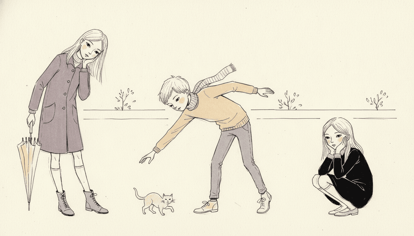
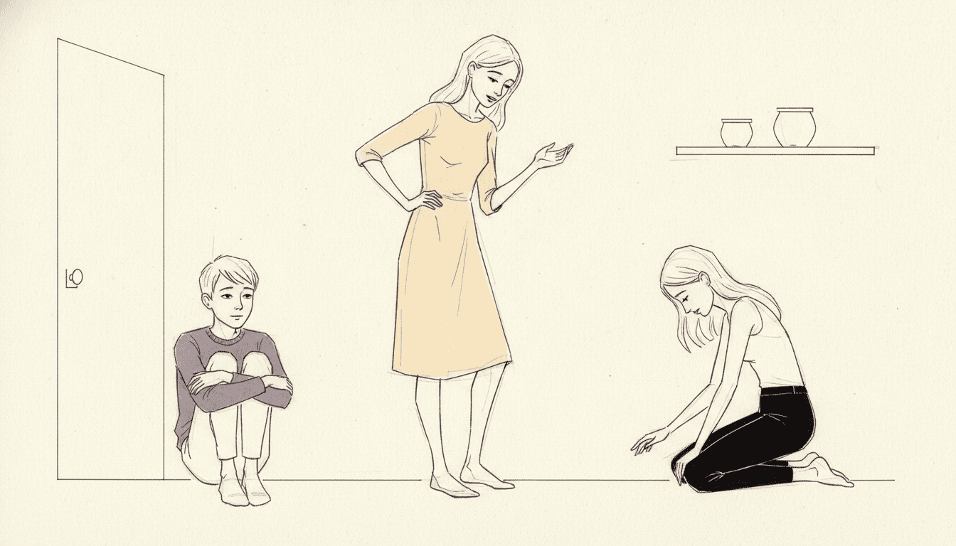
Look at the outlines in the middle one, along the bending girl’s back and arms. The contour is not a single line: it stops, restarts, and carries two or three fainter attempts alongside it where the pen felt for the edge. That is the whole argument of the style, left visible on the page.
Angular Line Art for Every Part of Your Story
One character held across four poses, a cast told apart by build alone, a single figure carrying a page, the three-colour palette itself, and whole scenes — the same taut linework spent on whatever your story is actually about.
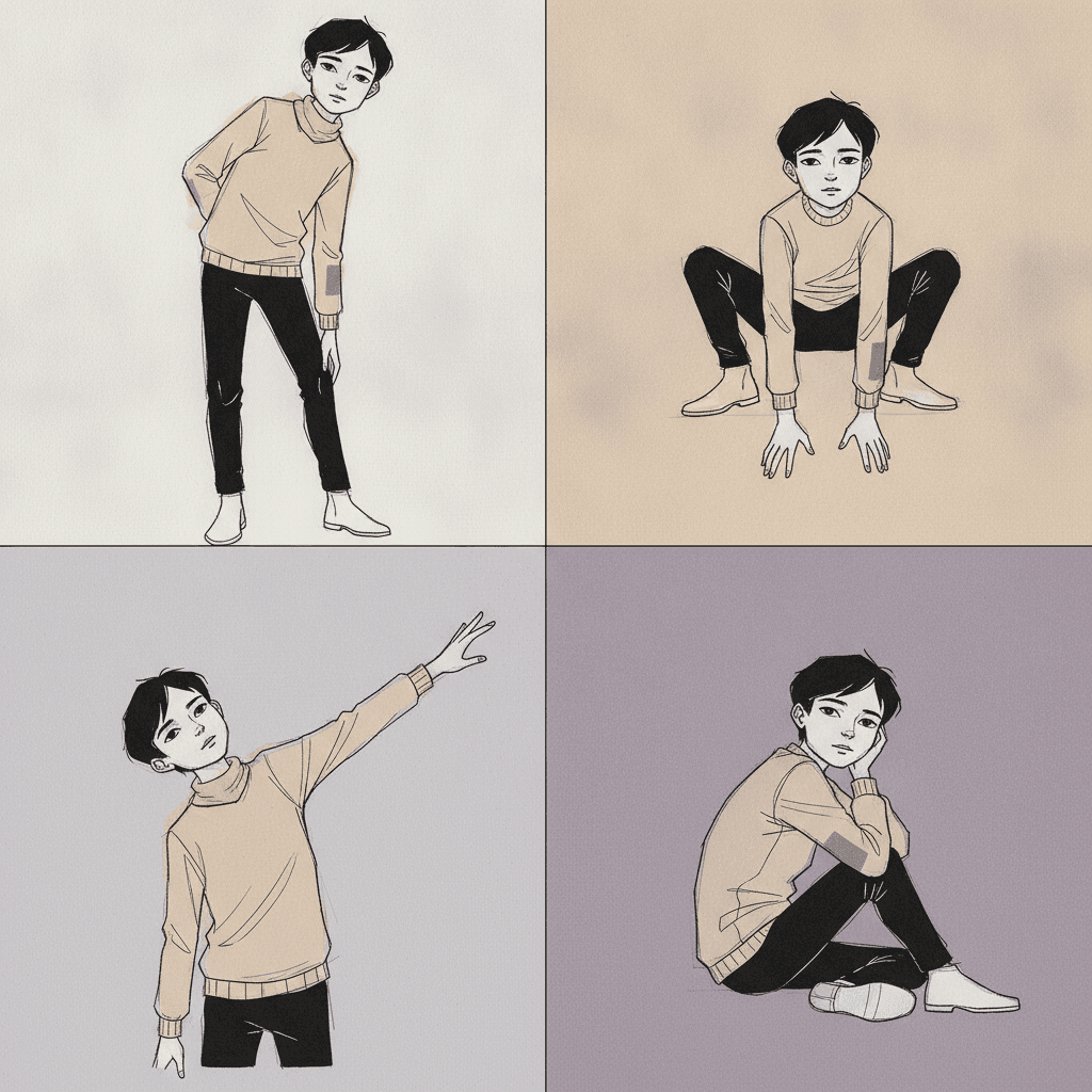
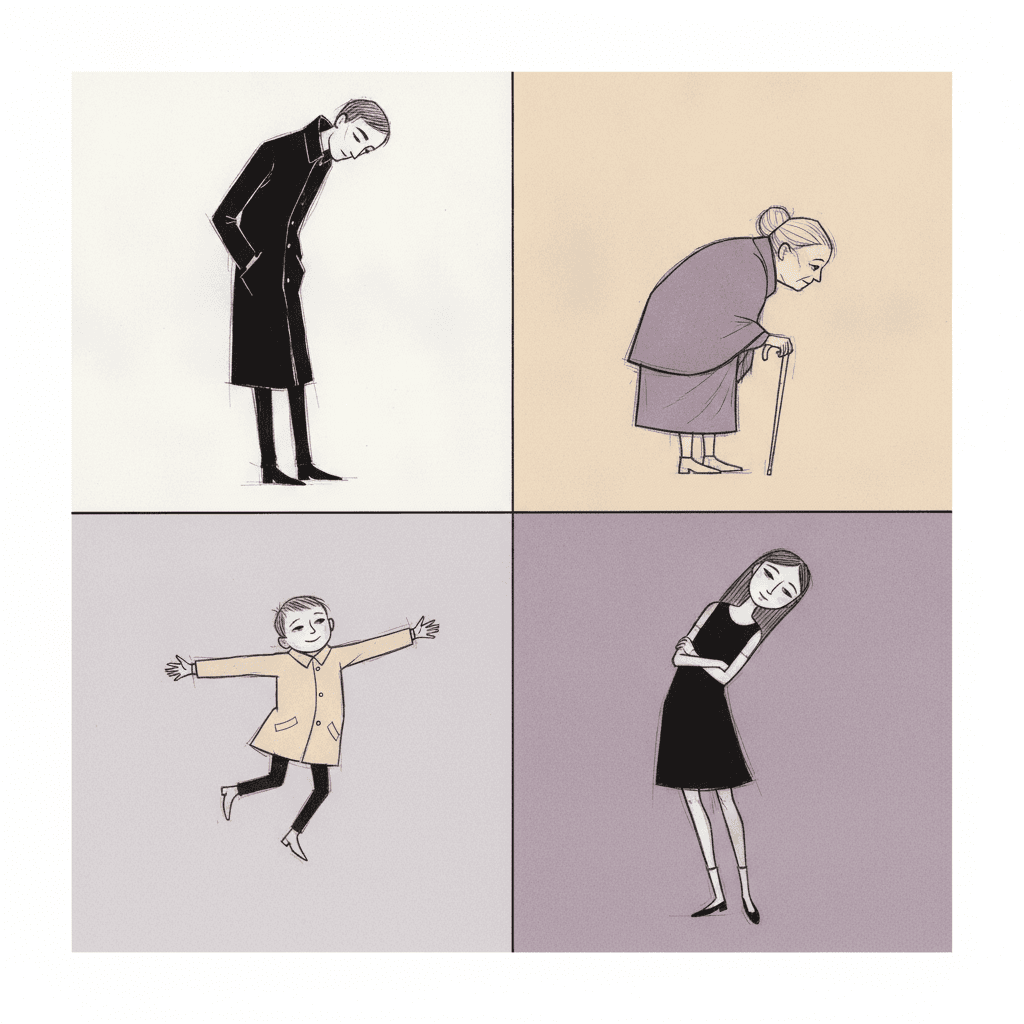
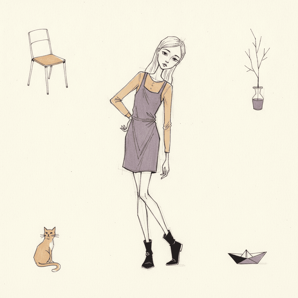
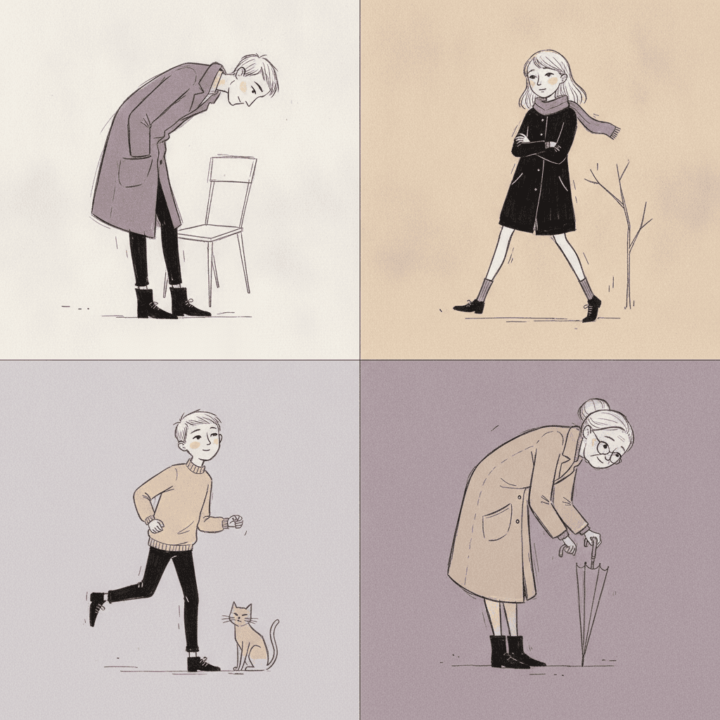
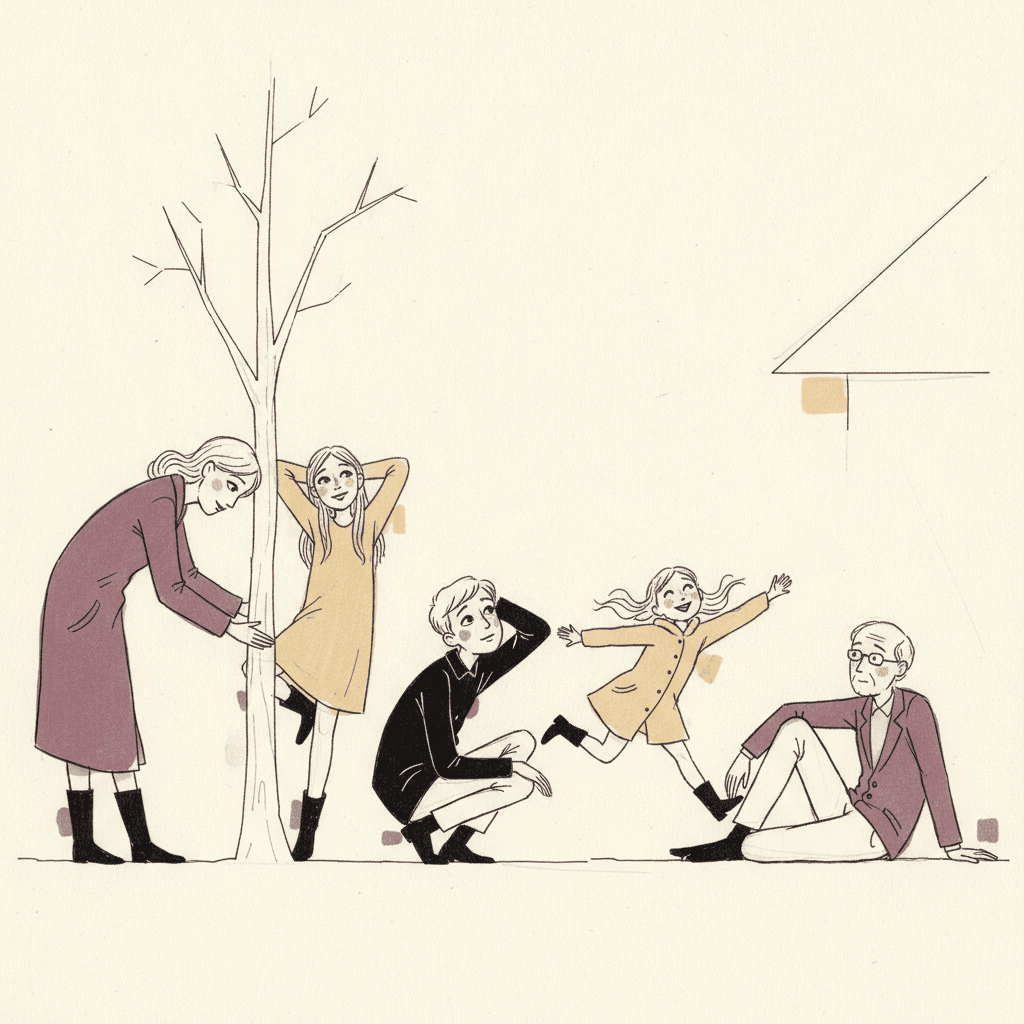
Everything You Need for Angular Line Picture Books
One expressive drawing is easy. Twenty-four pages whose line breaks in the same deliberate way, with a cast you recognise by build alone, is the part that needs building.
The same broken line on page one and on page twenty-four
A searching line is the hardest kind to keep consistent by hand, because it is defined by imperfection and imperfection drifts. One image comes out beautifully nervous and the next comes out merely messy. One fixed brief is carried into every page instead: broken sensitive contours, thin elongated bodies, distorted twisting poses, nervous searching strokes, sparse restrained colour, and the same four refusals of clean vector, cute rounded, neutral pose and polished. The gaps stay deliberate for the whole book.
Characters recognised by build and bearing, not by facial detail
Faces here are drawn with the same economy as everything else, which means your cast cannot be told apart by delicate features. They are told apart the way people are told apart across a street: height, how long the limbs are, whether the shoulders stoop or square, how the weight sits. That is genuinely good news for consistency, because a build survives from page to page far more reliably than an expression does. Save each character in the Character Library with up to fourteen reference images and they are reused across every page and into later books. Characters built from an uploaded photo stay private to your account.
Strong feeling, without a frightening picture
This is the honest note the style needs. A tradition of expressive figure drawing can slide towards the bleak, and that is not what belongs in a children’s book. Our generation guidance keeps the cast and the content appropriate: children and kind grown-ups, fully dressed, long-limbed but healthy, with sincere faces that can be wistful or worried or hopeful and are never grim, gaunt or ghoulish. The intensity is meant to live in the posture and in the hesitation of the line, not in anything a child would be upset to look at.
Three colours, so contrast has to be planned
The brief asks for sparse restrained colour and the palette names only bruised violet, pale ochre and ink black on bare paper. Two of the seventy-eight briefs ask for restrained colour at all, and this is one of them. Be clear-eyed about what that costs: the lighting is recorded as stark and uneven, but there is no modelled light source to stage a page with, so contrast on a spread comes from where you leave the paper empty and which of the three colours you spend. That is a composition decision, and it is better made deliberately than hoped for.
A whole book, not one life-drawing sheet
Expressive line work of this kind almost always exists as a single study: one figure, one sitting, one sheet of paper. You are not prompting for one of those. Describe the story and C2Story writes it, breaks it into pages and builds each page to this brief according to what that page actually says, so the taut linework is spent across a narrative with a beginning and an end rather than all at once on one drawing.
Better for older readers, in whichever language you read in
Worth saying plainly, because it narrows who this is for: the second thing the brief refuses is cute rounded, so this is not the style for a board book for a two-year-old. It suits readers who are old enough to read a body — roughly six and up — and stories that have a real feeling in them. Write in English, Chinese, Japanese, Spanish, French and more; the look does not change with the language, and the words of your story stay perfectly legible because they are set as type rather than drawn.
Angular Line Picture Books — Questions
What people ask before committing a whole book to a broken contour, three colours and a lot of bare paper.
Explore More Story Ideas
Discover more styles, tools, and story types

Princess Stories
Brave heroines on epic quests
Explore
Negative Space Books
Two colours, and the gap is a second picture
Explore
AI Story Generator
Generate complete stories with AI
Explore
ChatGPT vs C2Story
Purpose-built for picture books
ExploreAngular Line Picture Books — A Broken Contour, Long Twisting Figures and Almost No Colour
An angular line picture book is carried by its drawing and by nothing else. There is no paint, no flat colour fill, no modelled light and almost no background — only a thin ink contour that turns in hard corners rather than smooth curves, breaks into short separate strokes with visible gaps between them, and keeps the faint near-miss strokes of a searching hand beside it. On C2Story this is the Angular Expressive Line style, and its brief states the ambition plainly: expressive figurative line drawing, broken sensitive contour lines, thin elongated attenuated bodies, distorted twisting poses, nervous searching ink strokes and sparse restrained colour, carrying the same taut emotional linework through the whole scene your story describes. One brief applied across a whole book, so the twentieth spread is drawn from the same instruction as the first.
The thing worth knowing before committing a book to it is which part of that is genuinely rare, and here the answer is unusually clean. Read all seventy-eight of the hand-drawn style briefs enabled in C2Story and look only at what each says about the mark, and one word dominates: confident. It appears in twelve of them, and in ten it is attached directly to the line — clean confident outlines, crisp confident even lines, a confident tapering ink line, clean uniform confident lines, a clean confident single-weight line. It is the most repeated instruction in the library. This is the only brief that asks for the opposite, and the vocabulary it uses to do so belongs to it alone. Searching appears in one brief of seventy-eight. So do nervous, sensitive, anxious, attenuated, taut and distorted. Seven words, each used exactly once in the entire library, all of them in the same place. The recorded instrument is fractured sensitive lines. That is what the gaps and the extra strokes are: not a generation artefact to be forgiven, but the thing you are choosing.
Follow that one decision through and the rest of the look stops being a matter of taste and becomes a consequence. If the line is the whole picture, the line cannot be helped out by anything else — so the palette is recorded as restrained and muted and holds only bruised violet, pale ochre and ink black, with most of the paper left bare, and only one other brief in the library asks for restrained colour at all. If there is no rendering, there is no light: the lighting field reads stark and uneven, but nothing is shaded or modelled, so contrast on a spread comes from where you choose to leave the page empty. And because faces are drawn with the same four or five economical strokes as everything else, the feeling has to arrive through the body instead — which is why the fourth item on its list of refusals is neutral pose, the only time in seventy-eight briefs that a style rules out a character simply standing still. Its full list of refusals is clean vector, cute rounded, neutral pose, polished. Among the styles you can read about here, the fine-line ink style is the closest relative and splits from it on the steadiness of the hand, the ligne claire style is the purest statement of the confident line this one refuses, and the crosshatch style works in ink without colour too but spends its strokes on shadow instead of contour.
Three honest notes, because this style is easy to choose for the wrong reason. First, it is intense on purpose and its second refusal is cute rounded, so it is not the style for a board book for a two-year-old; it suits readers of roughly six and up and stories with a real feeling at the centre — a first morning somewhere new, missing someone, a falling out, a long tiring walk. Second, intense must never mean distressing, and we keep it on the right side of that: the cast stays children and kind grown-ups, fully dressed, long-limbed but healthy, with sincere faces that can be wistful or worried and are never gaunt, grim or ghoulish. Third, it cannot give you a world — no bright colour, no painted background, no weather, no night lit by a lamp — so if your story needs a place rather than a person, the gouache style or the cinematic style will serve you far better. In exchange you get a look that is unusually easy to keep consistent, because characters here are carried by height, stoop and limb length rather than by delicate facial detail — save each one in the Character Library with up to fourteen reference images and they are reused across every page and into later books, and characters built from an uploaded photo stay private to your account. Write in any language you read aloud in, then export the finished book as a PDF, which is the handoff to whichever printer you already use, and the images you generate are licensed for commercial use. Start free: see our pricing plans, browse every option on the illustration styles hub, or go straight to the AI Story Generator.